最近一段时间肯定会有很多站长朋友收到Google Search Console谷歌站长工具发来的邮件,提示网站有移动易用性的问题,即相关网页不适合在移动端展示。(Google Search Console移动设备易用性报错!)
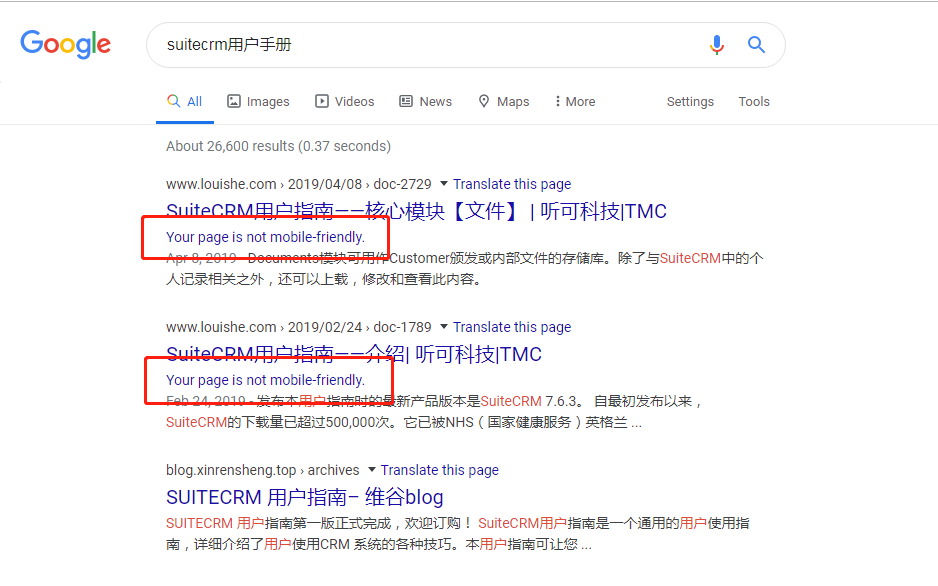
而且在Google搜索引擎中搜索,报错:“Your page is not mobile-friendly”。
Google Search console新版本中“移动设备易用性”。这个是用来检测你的网站流量是否可以完美的支持移动端设备。很多人不仅要问,移动端有什么好看的,主流不是PC端么?
但是移动设备的使用率已经远远高于PC端。你可以这么理解,如果你先在还没有开始做移动端页面,或者说你的落地页依然不支持移动端的话,你有可能损失大一波用户流量。
下面开始Google Search Console移动设备易用性报错修复
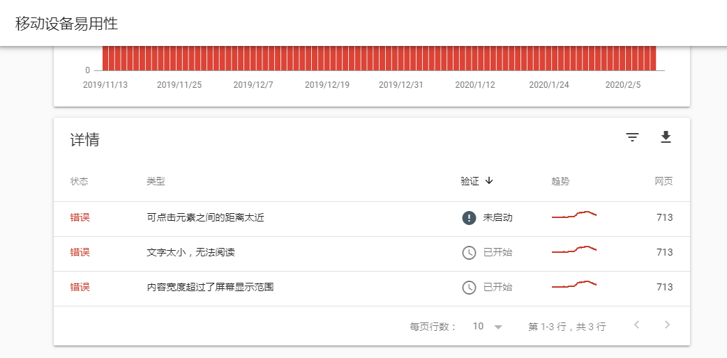
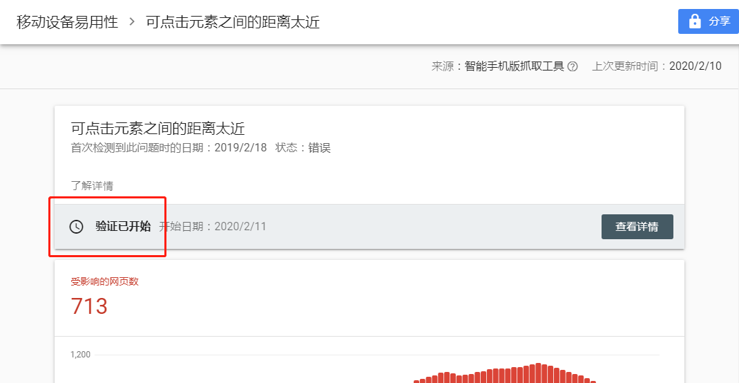
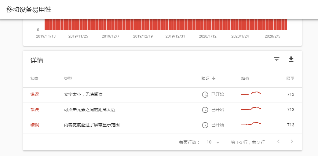
去 Google Search Console 站长工具查看移动设备易用性如下:有将近713篇相关文章都报移动设备易用性问题。报错主要有以下3点问题:
- 可点击元素之间的距离太近
- 文字太小,无法阅读
- 内容宽度超过了屏幕显示范围
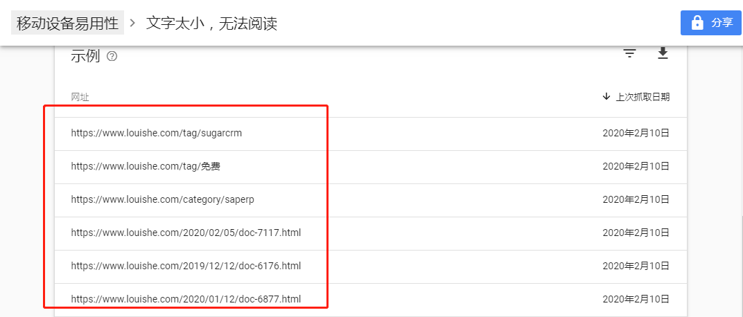
那我们就要看这些713个网页页面,到底是哪些具体页面?这些页面确实有移动设备易用性问题吗? Google Search Console 站长工具还是比较人性化,他会把所有出现问题的页面列举出来。
例如:你想看“文字太小,无法阅读”报错的所有页面,你只需要点击, Google Search Console 站长工具会罗列出所有出现的问题页面。
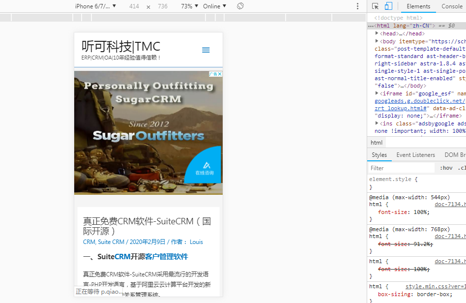
我们打开上面报错列表中任意一条域名,我们用手机打开,发现其实文字并没有太小,也是可以正常进行阅读的。因为我的正文内容字体大小都设置在16px以上。如果文字大小不能明显察觉报错的话,我们查看一下“内容超过了屏幕显示范围”这个报错中的网址。我们随时打开几个报错网址,也没有发现内容溢出屏幕的现象。
那就没有方法检测出 Google Search Console 站长工具 为什么报移动设备易用性问题吗?
Google Search Console 站长工具 强大之处又体现出来了, Google Search Console 站长工具 本身就可以显示出您所有报错页面的详细报错信息。
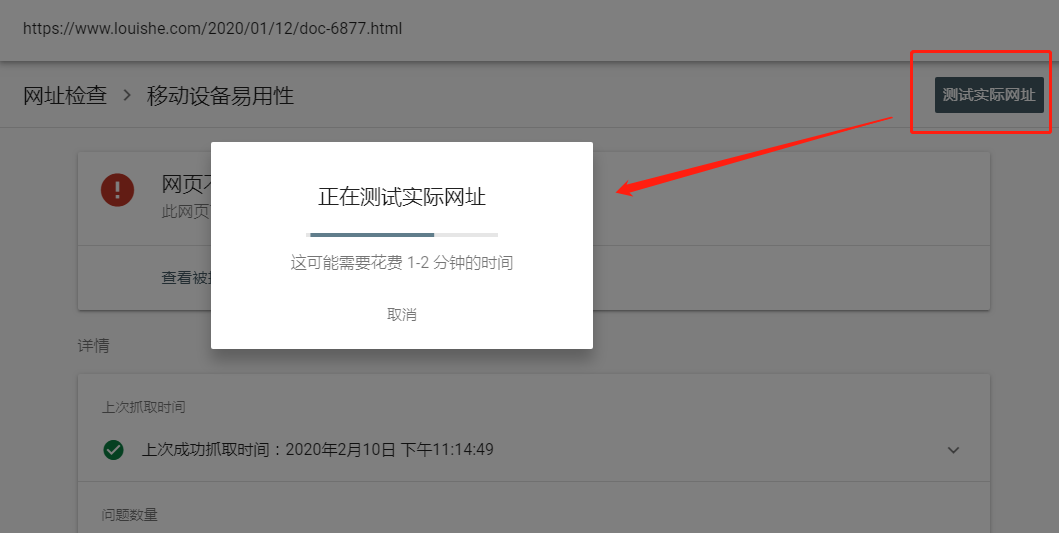
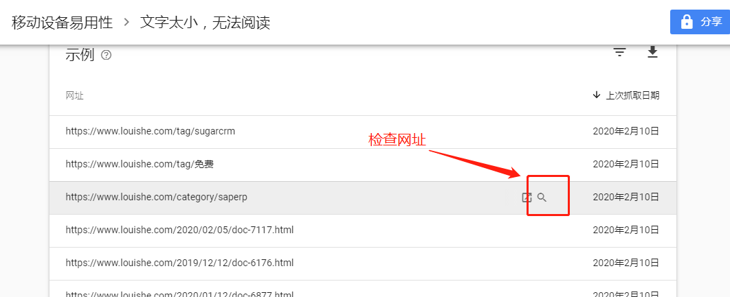
首先找到其中一条报错链接,然后点击链接后面的放大镜按钮(检查网址)
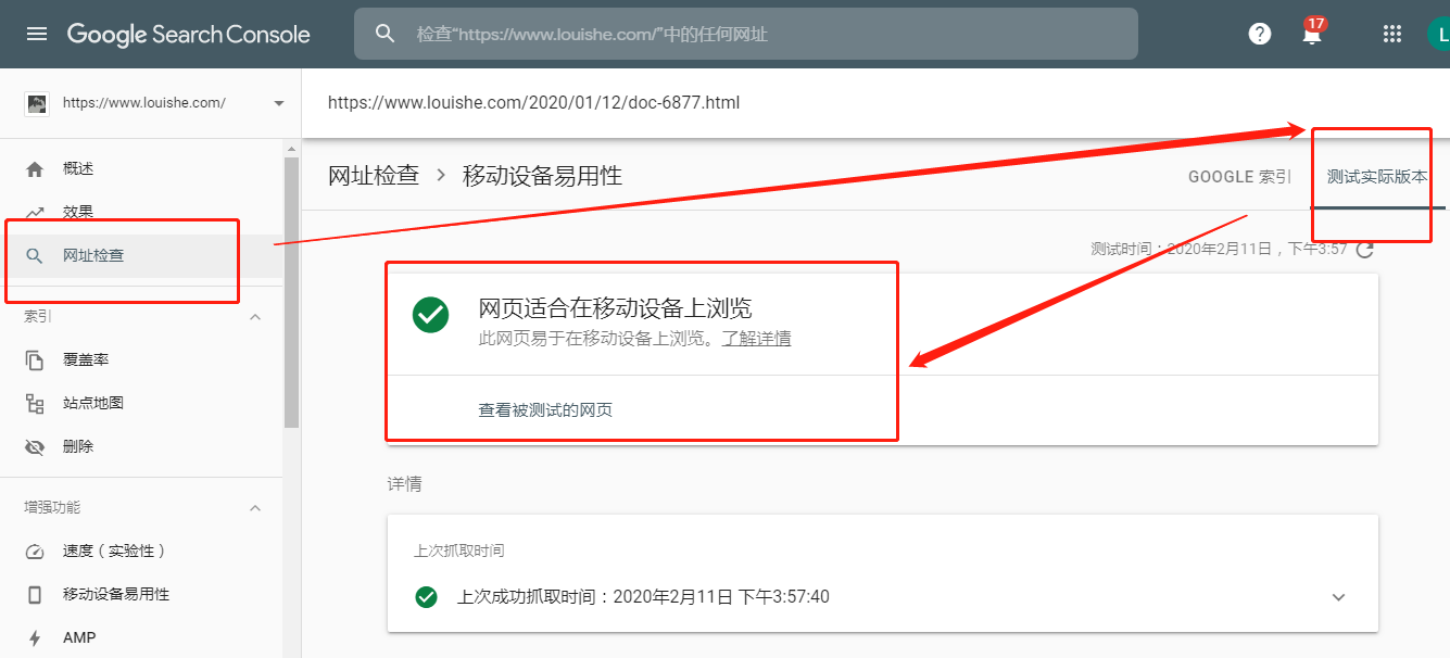
网址检查——测试实际版本,测试完成后,会在右边出现检测后的“屏幕截图”、“详情”。现在看到 Google Search Console 站长工具 提示的报错就出现了,部分图片溢出,撑开屏幕!!!
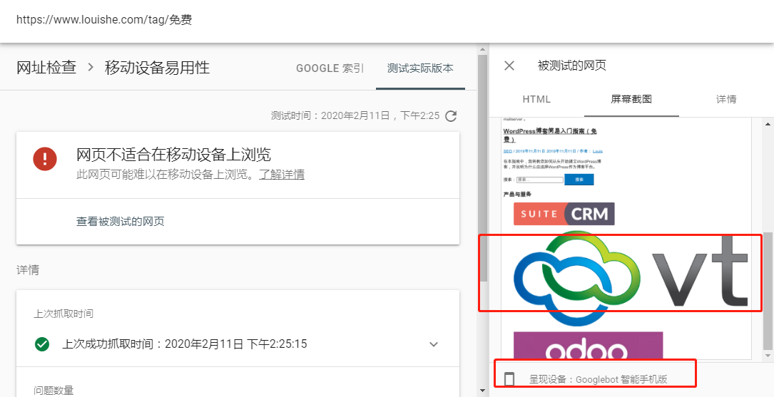
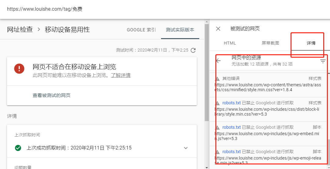
但是!你在自己的手机端肯定不会出现图片撑开屏幕的情况!什么原因呢?我们再看“详情”栏目。其中多条报错显示,是因为robots.txt禁止抓取了链接。这个就是我们今天的问题突破口:会不会是robots.txt禁止google抓取了必要的分析JS和CSS,才导致“移动设备易用性” 的报错呢?
不管如何,我们看一下,目前我们robots.txt都屏蔽了哪些内容?
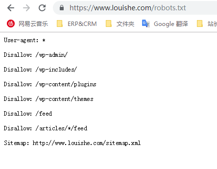
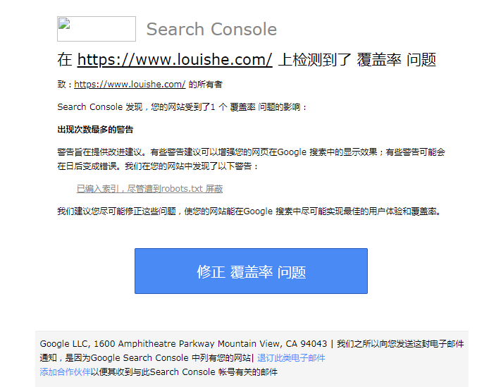
在我查看Mobile Friendly Websites 常规错误的时候发现了我的问题,如果您网站的 robots.txt 文件禁止抓取这些资源,则会直接影响我们的算法呈现您的内容以及将其编入索引,进而导致您的网站排名降低。
所以去掉 robots.txt 禁止抓取页面。
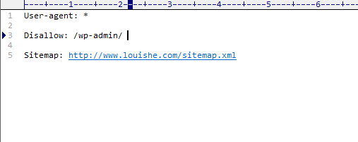
再去提交提交验证修复即可。
所有报错提交验证后,等待验证!
备注:如果此时你再检查网址,你必须“测试实际网址”,因为默认检测“索引”中的网址,索引中的网址由于是之前抓取收录的肯定还会报错。只有检测实际网址才会显示一切正常。